
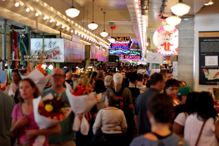
A shopper walking down a commercial block makes a decision about a store before ever touching the door. That decision — notice it, ignore it, consider entering, keep walking — happens in the seconds it takes to read a facade from across the street. Storefront signage is doing most of that work, whether or not a retailer has thought about it that way.
For retail professionals, it’s worth treating retail signage as less of a fixed asset and more of a moving part in the customer journey: something that has to perform at thirty feet, at three feet, and again once a shopper is standing in the aisle looking for the right department.
First Impressions and Business Visibility
Before a customer forms an opinion about a store’s products, service, or prices, they form one about its storefront. That’s the practical role of signage: it’s usually the first and sometimes only signal a passerby gets before deciding whether to look closer.
A few things determine whether that signal lands:
- Visibility from the street or sidewalk. A sign mounted too high, too small, or blocked by trees and awnings doesn’t get read — it gets missed. Retailers often design signage for how a storefront looks in a photo, not for how it’s actually seen by someone walking or driving past at a normal pace.
- Contrast and readability. Light text on a light background, or a busy background behind lettering, forces a passerby to work for information they’d otherwise absorb in a glance. High contrast between letters and background is what makes a sign legible from a distance, not size alone.
- Sign placement relative to approach. A sign that reads perfectly from across the street may be invisible to someone approaching from the parking lot on the same side of the building. Retailers in strip malls and shopping centers, in particular, need signage that works for more than one line of sight.
- Consistent visual identity. When a storefront sign, window graphics, and any secondary signage don’t match — different fonts, different color treatments, an older logo next to a newer one — it reads as unfinished, even if each individual piece is well made.
Consumer research backs up how much weight signage carries at this stage. In a national FedEx Office survey of over 900 U.S. consumers, 76% said they had entered a store they’d never visited before specifically because its signage caught their attention, and 68% said they’d made a purchase because a sign drew them in. The same survey found 60% of respondents said the absence of clear signage would keep them from entering a business at all, and just over half said they’d be less willing to enter a store with a misspelled or poorly made sign. The numbers are more than a decade old, but the underlying behavior — judging a business by how clearly it presents itself before you’ve stepped inside — hasn’t changed with the storefronts.
Cluttered or outdated signage works against all of this. A sign that’s trying to communicate five things at once — the business name, three promotions, a phone number, and a set of hours — usually communicates none of them clearly. The same is true of a sign that’s simply aged out: faded vinyl, a flickering channel letter, or a logo that hasn’t been updated in a decade can quietly signal that the business behind it isn’t being maintained either.
Illumination extends this first-impression window into the hours when a storefront would otherwise go dark. A boutique that closes at 7 p.m. is still passed by commuters, restaurant-goers, and evening foot traffic long after its interior lights go off, and an unlit sign disappears into the block at exactly the moment ambient light drops. Backlit and illuminated formats — including options like Lightbox Signs — keep a storefront legible after dark without relying on street lighting to do the work, which matters most for retailers in mixed-use areas where evening browsing is common.
Helping Customers Understand the Store Before They Walk In
Visibility gets someone to look. What happens next is a much faster and more practical evaluation: what is this place, what does it sell, and is it relevant to me right now?
Good signage answers those questions without requiring a customer to walk closer or pull out their phone. A hardware store, a nail salon, and a specialty coffee shop all need a passerby to identify what they are almost instantly — and the businesses that make that identification easy remove a layer of hesitation that otherwise keeps people walking.
This is where a lot of signage underperforms, not because it’s poorly made, but because it optimizes for the wrong thing. A stylized logo can look sharp on a business card and still fail on a storefront if it doesn’t communicate category at a glance. A shopper deciding whether to detour into an unfamiliar store is making a fast, low-commitment judgment — signage that makes that judgment easy (a clear name, a recognizable icon, a short descriptor like “shoes” or “bakery”) reduces the uncertainty that keeps people from bothering to find out more.
How Signage Shapes the Experience Once Customers Are Inside
The role of signage doesn’t end at the door. Retail store signage continues to guide the customer experience for as long as someone is in the building, and this is often the part retailers spend the least time thinking about.
Wayfinding and department identification
In a store of any real size, customers orient themselves using signage the same way they’d use it in an airport or a parking garage. Overhead department signs, aisle markers, and directional signage reduce the friction of “where do I find X” — and every extra minute a customer spends searching is a minute where they might decide to leave instead.
Entrances, exits, and functional areas
Clear identification of entrances, checkout, fitting rooms, and restrooms isn’t glamorous, but it’s part of the same experience the storefront sign started. A customer who has to ask an employee where the fitting room is has had a slightly worse experience than one who found it on their own — not because the store failed dramatically, but because the environment didn’t do its job.
Promotional and informational signage
Interior signage is also where promotions, return policies, and other practical information reach the customer at the moment they’re deciding whether to act — near a register, at the end of an aisle, next to a featured display. This is a continuation of the same communication job the storefront sign started outside, just at closer range and higher detail.
The Behavioral Link Between Visibility and Foot Traffic
It’s worth being precise about what signage can and can’t claim credit for. Good signage doesn’t guarantee a sale, and no retailer should treat it as a substitute for product, price, or service. What it does is remove friction from the decision to walk in — and friction is what determines whether a potential customer becomes an actual one.
Consider a realistic scenario: a shopper walking to lunch passes three storefronts in the space of a block. One has no visible sign from the sidewalk. One has a sign but no indication of what’s inside beyond a stylized wordmark. The third clearly identifies itself as a bakery, and a small illuminated sign near the door highlights a limited-time offer. All three businesses may sell equally good products, but only the third gave that shopper enough information, in the two or three seconds available, to make entering worth considering.
This is the practical version of the connection between signage and foot traffic: visibility gets attention, clear messaging turns attention into understanding, and understanding is what lets a customer decide the store is relevant enough to enter. None of that requires exaggerated claims about guaranteed sales increases — it’s a description of how people actually make quick decisions on a sidewalk or in a parking lot.
Modern Storefront Branding: Consistency Over Clutter
Storefront branding today tends to reward restraint. The retailers who read as most established, ironically, are often the ones using the fewest visual elements — a consistent typeface, a defined color palette, and materials that hold up over time rather than a sign trying to do everything at once.
A few principles show up repeatedly in well-executed storefront branding:
- Typography that’s legible first, distinctive second. A custom font that looks great in a logo file can become unreadable at sign scale from across a parking lot.
- A tight color palette, used consistently across the storefront, window decals, and any digital presence, so a customer recognizes the brand whether they’re looking at the sign or the website.
- Lighting treated as part of the design, not an afterthought bolted on after the sign is installed.
- Materials chosen for durability, since a faded or discolored sign undercuts brand consistency faster than almost anything else.
- Simplicity, both in message and in visual elements, so the sign reads clearly at the distance it’s actually going to be seen from.
The goal isn’t a specific sign type or material — it’s whether someone glancing at the storefront, and someone later looking at the same brand online, would recognize them as the same business.
Promotions and Customer Action
Storefront and window signage is also one of the few marketing channels that reaches a customer at the exact moment they’re deciding whether to walk in. A seasonal sale, a new product launch, or a limited-time offer displayed clearly near the entrance gives an already-interested passerby one more reason to act now rather than later.
The message matters more than the format here. “Now Open,” a clearly dated sale window, or a specific offer (“20% off outerwear this weekend”) gives a customer something concrete to weigh. Vague or stale promotional signage — a “Sale” banner that’s been up for eight months — tends to be discounted by customers who’ve learned it doesn’t mean much. The function of promotional signage isn’t decoration; it’s giving someone who’s already curious a specific, time-bound reason to follow through.
A Practical Signage Checklist for Retailers
Retailers reviewing their existing storefront signage can start with a short set of questions rather than a full redesign:
- Can it be read in the time a passerby actually has? Stand across the street and give yourself three seconds — that’s roughly what a walking or driving customer gets.
- Is it visible from the way customers actually approach? Check sightlines from the sidewalk, the crosswalk, and the parking lot, not just head-on.
- Does it clearly communicate what the business is and sells? A logo alone often isn’t enough for an unfamiliar customer.
- Does it match the brand customers see elsewhere — online, on packaging, on other locations?
- Is important information competing with visual noise? Too many messages on one sign usually means none of them get read.
- Does the signage help customers know where to go next? Once someone reaches the door, is it obvious where to enter, and once inside, where to go?
None of these require a full signage overhaul to act on. Most retailers can walk their own storefront with this list and find at least one place where clarity has quietly slipped — a faded panel, a promotion that’s stayed up too long, an entrance that isn’t as obvious as it feels from behind the counter.
Signage is one of the few retail investments that keeps working continuously, without staffing or a marketing spend, for as long as it’s legible and current. Treating it as part of the customer journey — not just an identifier bolted to the building — is what separates a storefront that gets walked past from one that gets walked into.
Related Articles

September Isn’t a Shopping Season Anymore. It’s a Moving Target.
September has always been an important reset for retail. But this year, it offers a useful reminder that consumers increasingly dictate their own shopping calendar.

Always Adapting: How To Incorporate Innovative Tech and New Strategies into Your Marketing
The first and most basic way to incorporate new marketing strategies is by encouraging innovation and creative risk at your firm. Teams sometimes have to think in new and exciting ways to make moves when old tactics are no longer working as they used to. Leaders need to embrace the most reliable parts of classic methods while experimenting with innovative tools and new strategies.

Why relevance is retail’s next competitive advantage.
The study of over 1,000 U.S. consumers makes it clear: the issue extends beyond inbox fatigue. Generic brand communications are impacting consumer productivity, eroding trust, altering brand perception, and changing how consumers engage with brands.

Don’t Let Grocery Suppliers Let You Down This Summer. Here’s How To Stop Them.
When consumer budgets are squeezed and shoppers are making tighter decisions, an
empty shelf, a mislabeled pallet, or a late shipment doesn’t just cost you sales. It costs you relationships. And it costs you during the period when food and beverage volumes, including cold beverages, seasonal packaged goods, grilling staples, and snacks are at their highest.
 for the latest news and job opportunities in retail tech